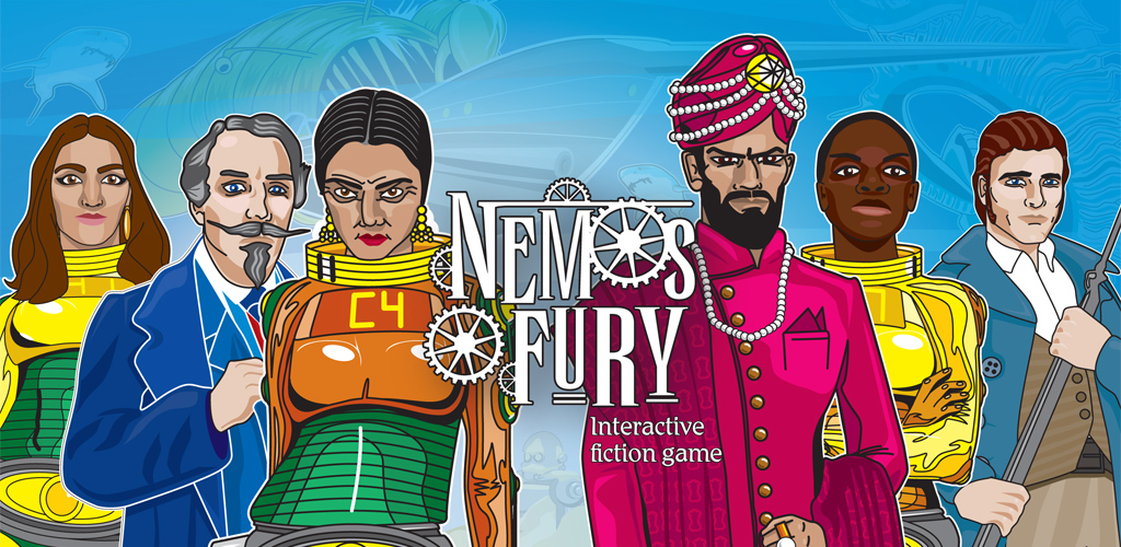
So when Nemo’s Fury is launched it has to have an icon so everyone who owns the game can identify it on their mobile device.
I was going to use the Nemo’s Fury logo, but when it’s scaled down it will become a brown blurry mess and practically unreadable. Which is not ideal.
So I set about designing an icon from scratch. But what?
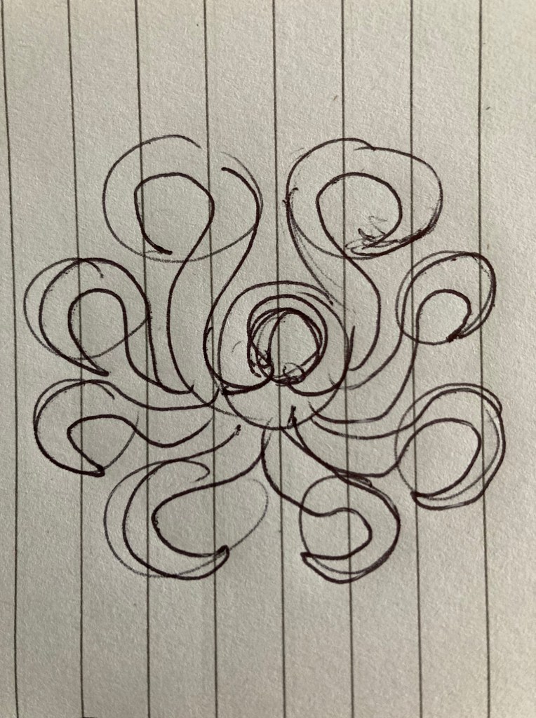
Well if there’s one creature Captain Nemo is associated with its a giant squid. Which are tricky to draw. But an octopus is a more than able substitute, especially at the scale the icon will be viewed at.
So I sketched out a few designs with pen and ink – I always begin with pen and ink.

I drew these left to right and top to bottom and then having arrived bottom left, I worked it up a bit.
Then fired up Adobe Illustrator, my favourite drawing tool, and the one I’ve used for all my artworks on Nemo’s Fury.
And here’s the finished result! Simple, bold and suggestive of all the excitement and underwater peril that awaits the adventurer!


You must be logged in to post a comment.